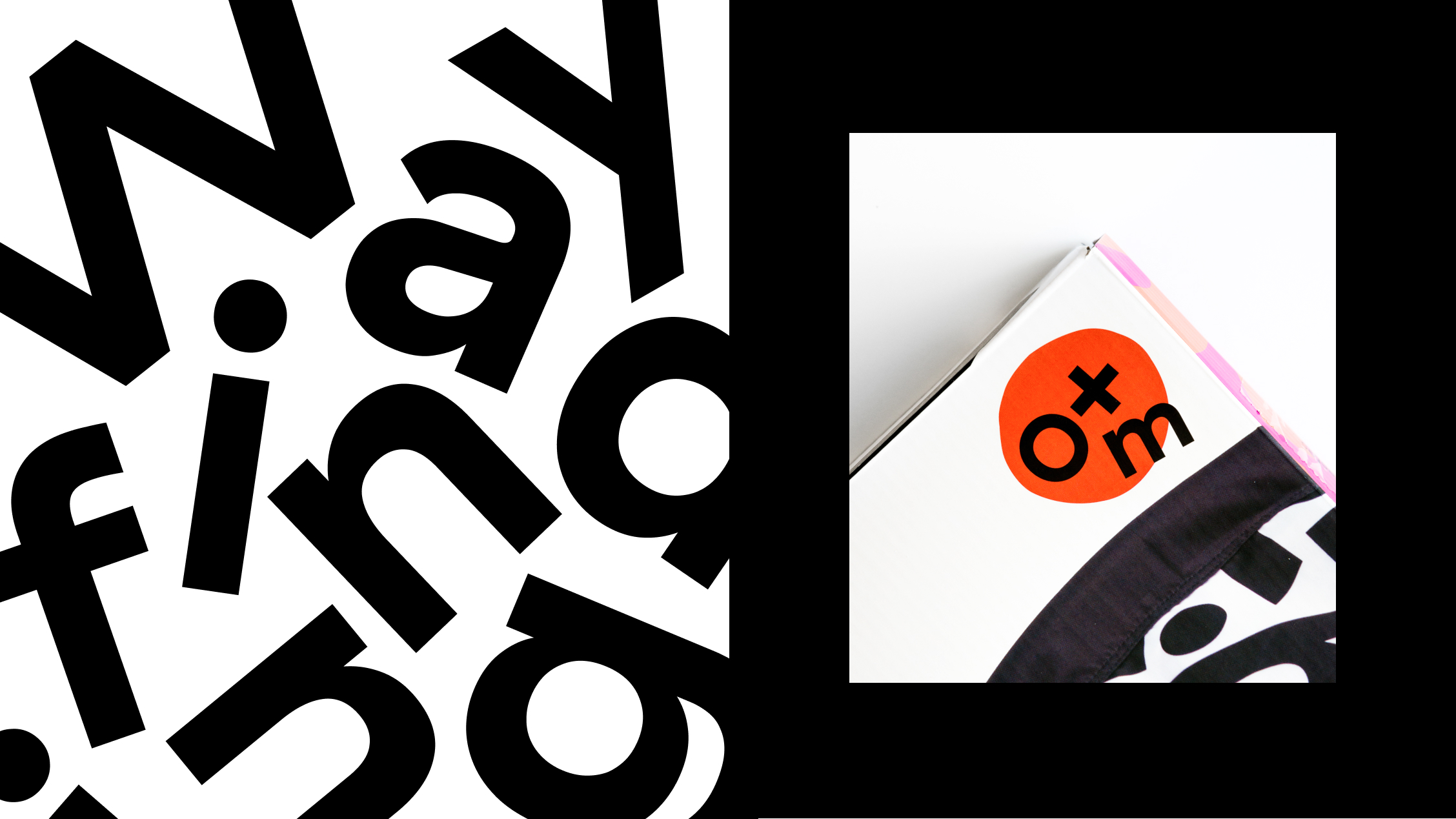
The new strategy encourages curiosity. The identity system was created around the stark contrast of black and white for two reasons. The black and white system created clear distinction from the colorful competition on shelf. Our graphic lettertoss pattern provided the bold impact while on shelf.
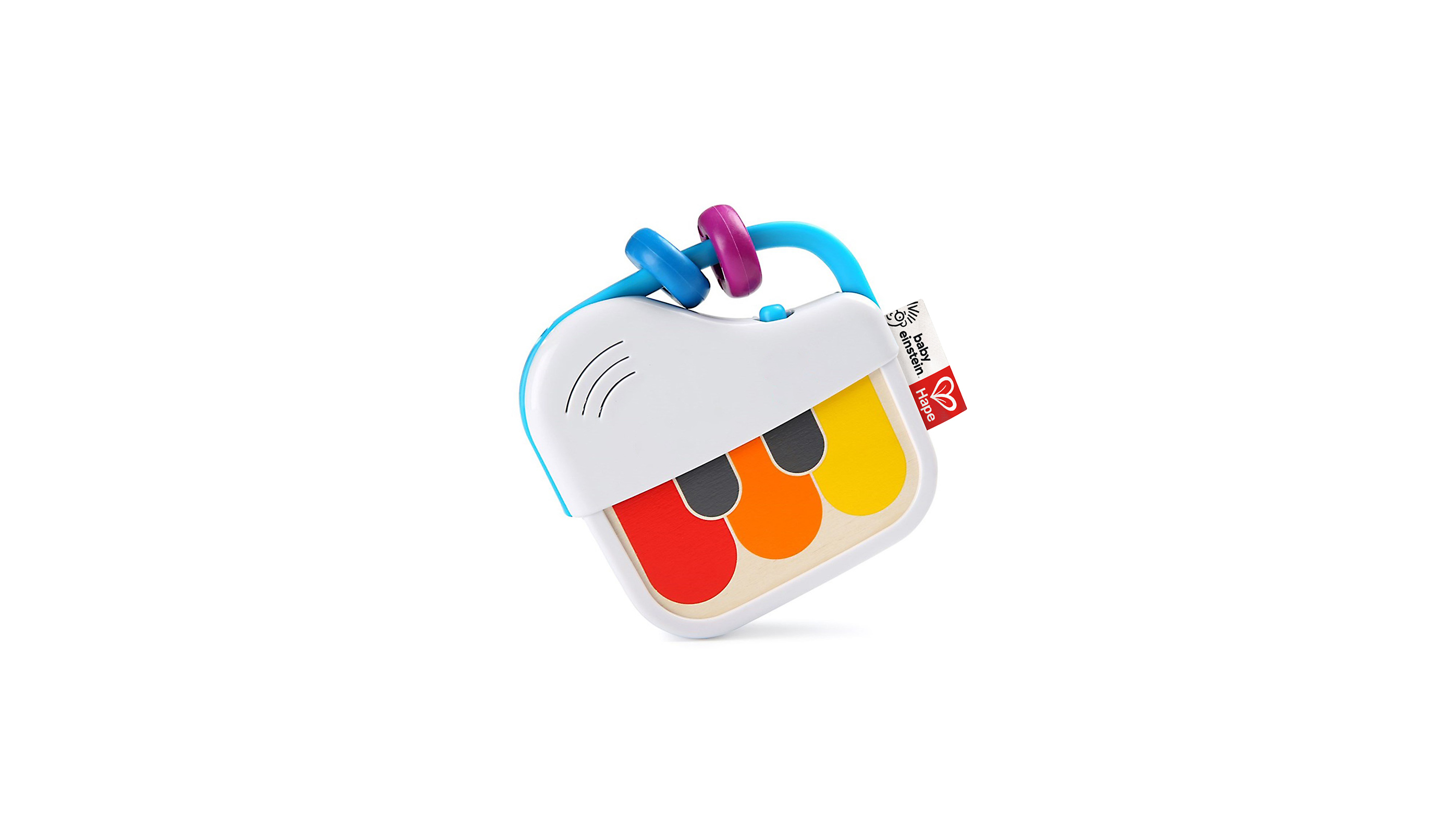
The packaging system was created to scale globally. It was pressure tested to accomodate up to six languages. We built the pack system upon the patterns our customers are used to following while shopping the toy aisle. We established a clear hierarchy of brand, name and age wayfinding.
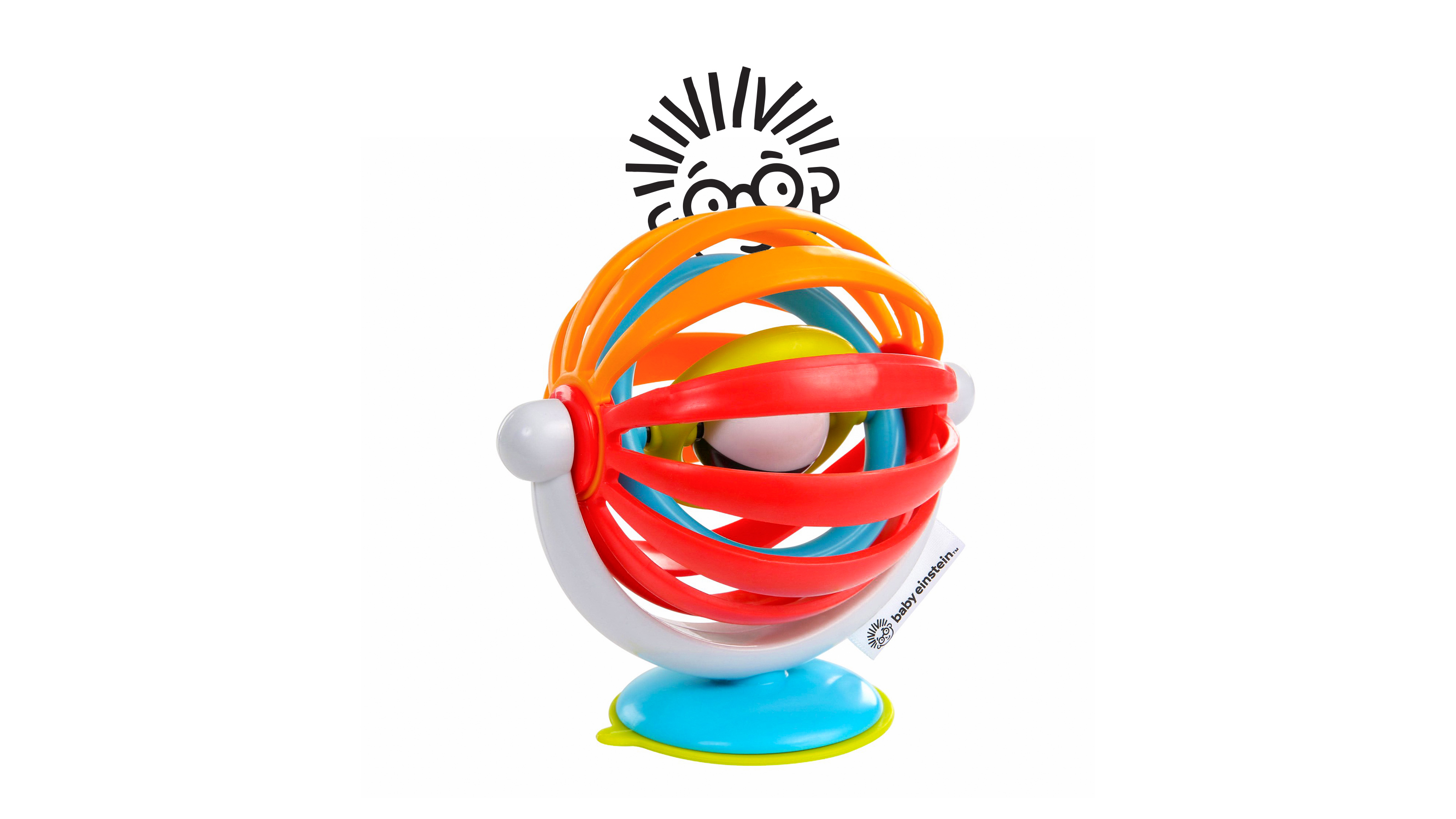
The packaging system was created to scale globally. It was pressure tested to accomodate up to six languages. We built the pack system upon the patterns our customers are used to following while shopping the toy aisle. We established a clear hierarchy of brand, name and age wayfinding.